

The Complete Neutral Color Palette Guide for a Serene, Sophisticated Home
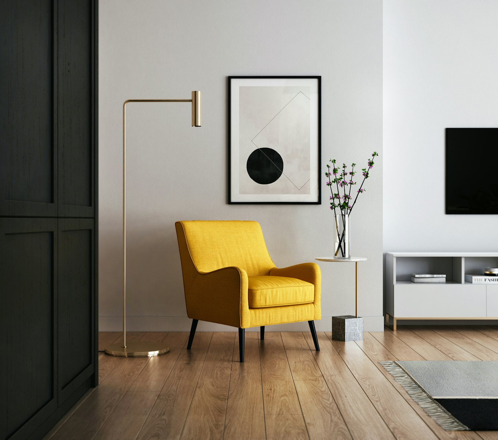
Neutral colors are simultaneously the most versatile and the most misunderstood tool in interior design. On one hand, they are universally beloved — survey after survey shows that homeowners gravitate toward neutral palettes when choosing paint colors, furniture, and soft furnishings. On the other hand, neutrals are frequently deployed in ways that result in rooms that feel flat, boring, or somehow off despite technically looking like the beautiful neutral rooms in the design magazines. The difference between a neutral scheme that feels alive and one that falls flat almost always comes down to a nuanced understanding of undertones, layering, and the use of texture to create depth. This guide will teach you everything you need to know to work with neutrals like a professional.
Understanding Undertones: The Hidden Key to Neutral Color Success
The most common mistake people make when working with neutral colors is treating them as if they are simply the absence of color. They are not. Every white, every cream, every gray, every beige has a distinct undertone — a subtle cast of another color that becomes visible in certain lighting conditions and when placed next to other colors. Understanding undertones is the difference between a neutral palette that feels harmonious and one that feels perpetually off.
Whites can have warm undertones — a yellowish, peachy, or pinkish cast — or cool ones, with blue, green, or purple hints. Grays typically have blue, green, or purple undertones. Beiges and taupes tend to have warm undertones — yellow, pink, or orange — though some lean cool with green or gray undertones. The principle for using neutrals successfully is to choose colors from the same undertone family and to let your fixed elements — your flooring, cabinetry, and any other elements you cannot change — dictate which undertone direction you go. A room with warm honey-toned hardwood floors will fight against cool gray walls. Warm creamy walls will sing in the same space.
Building a Layered Neutral Palette
A neutral palette that works has multiple tones layered together rather than a single flat neutral applied to every surface. Think of it as a composition with a light note, a medium note, and a deep note, all within the same undertone family. The lightest tone — a warm white or pale cream — typically goes on the walls and ceiling, creating the bright, spacious foundation of the room. The medium tone — a warm linen, a soft greige, a sandy beige — appears in the large furniture pieces: the sofa, the rug, the curtains. The deeper tone — a warm brown, a charcoal, a dark wood — grounds the palette in the coffee table, side tables, and accent furniture.
Within this framework, you can introduce small doses of accent color without disrupting the neutral foundation: a rust cushion, a sage green vase, a dusty blue throw. These accents introduce personality and visual interest while the neutral framework maintains the sense of calm and coherence that makes neutral rooms feel so restful and beautiful.
Warm Neutrals vs. Cool Neutrals: Choosing Your Direction
One of the first decisions to make when building a neutral palette is whether to go warm or cool. Warm neutrals — creams, ivories, warm whites, taupes, caramels, warm grays — create an environment that feels welcoming, comfortable, and organic. They pair naturally with natural wood tones, rattan, warm metals like brass and copper, and the earthy tones of linen, jute, and terracotta. Warm neutral rooms feel like they belong in the landscape of the countryside or a warm climate city apartment.
Cool neutrals — pure whites, blue-grays, sage greens with gray undertones, cool beiges — create an environment that feels more modern, clean, and fresh. They pair well with white oak, marble, polished concrete, chrome and nickel metals, and the cooler tones of blues and greens. Cool neutral rooms feel crisp, architectural, and contemporary. Neither direction is right or wrong — it is a matter of the feeling you want to create and the fixed elements you are working with.
Using Texture to Bring Neutrals to Life
In a neutral room without enough texture, even the most beautifully chosen palette of harmonious tones can feel flat and dull. Texture is what gives a neutral scheme its dimensionality — it creates depth, interest, and warmth without introducing color or pattern. The visual richness of a beautifully textured neutral room comes from the interplay of different surfaces: the sheen of a polished concrete floor against the matte roughness of a linen sofa, the warmth of a woven wool rug against the smoothness of a painted wall, the organic grain of a wooden coffee table against the clean lines of a modern side table.
Think about texture in every layer: walls can be textured with limewash paint, plaster, or grasscloth wallpaper rather than flat paint. Sofas in linen, velvet, or bouclé offer rich tactile interest. Rugs in jute, wool, or hand-knotted pile create warmth underfoot. Throws in chunky knit or mohair beg to be touched. Ceramic and stone accessories bring an earthy, organic quality. The more varied and intentional your textures, the more alive and interesting your neutral palette will become.
Neutrals Across Different Rooms
While neutral palettes work beautifully in every room of the home, the specific application changes based on the function and character of each space. In the living room, warmth and layering are paramount — lean into the softer, cozier neutrals. In the kitchen, clean and functional tend to dominate, so crisper whites and light grays often serve best. In the bedroom, the warmest, softest neutrals create the most restful and nourishing atmosphere. In home offices, a cooler neutral with a more focused, clean quality can help maintain concentration.
Conclusion
Neutrals are not boring — when understood and applied with skill, they are among the most sophisticated and beautiful palettes available to the interior designer. The key is understanding undertones, building in layers, and using texture generously to create depth and warmth within the palette. A well-executed neutral interior is one that feels simultaneously restful and rich, simple and deeply considered.
Explore our curated collection at Little-Chapter.com for beautifully crafted textiles, ceramics, and accessories in the warm, neutral tones that will bring your palette to life.